Create a Ticket Tile
From Dashboard > Dashboard 2.0, create a new dashboard or select from an existing dashboard collection.
See Create Dashboards to learn about creating dashboards.
Click CREATE TILE or + from the toolbar.
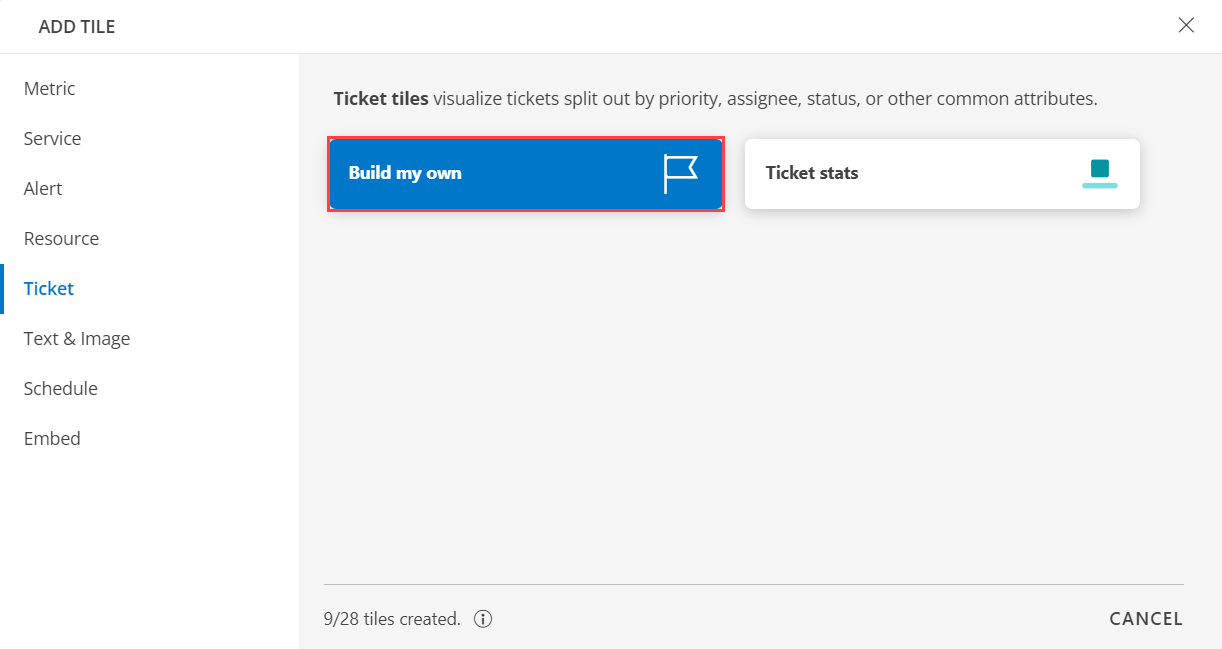
In the ADD TILE screen that appears, select TICKET.

- Select one of the following:
| Tile Option | Functionality |
|---|---|
| Build my own | Visualize tickets split out by priority, assignee, status, or other common attributes. |
| Ticket stats | Visualize total count of new and open incidents. |
Build my own
Click here to view how to Build Your Own Query
- Select the Build my own tab. This enables you to create a custom tile.
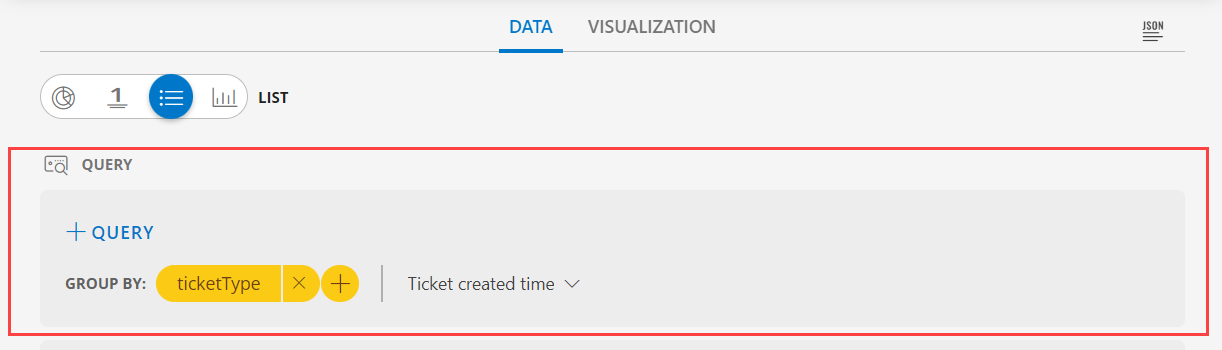
Click the + QUERY and select the attributes from the drop-down list as you build the query. Click the + button to add additional attributes.
Note: You can combine multiple filters together to view only the required alerts. The query is completed and the results are displayed in the preview graph.
Alternatively, click </> to use the advanced query builder.
Note: Click </> again to close the advanced query field and switch back to the basic query builder format.Enter a query or click inside the box to see a list of OpsQL attributes.
Click the optional Legend icon and enter {{ in the EDIT LEGEND field to see a list of options.
Select the data type from the following options:
| Chart Type | Description |
|---|---|
| Pie | Displays a pie chart. |
| Single Value | Displays a single value. |
| List | Displays values in a list format. |
| Bar | Displays the bar representation of the values |
- From the GROUP BY option, select an attribute. You can select up to two attributes.
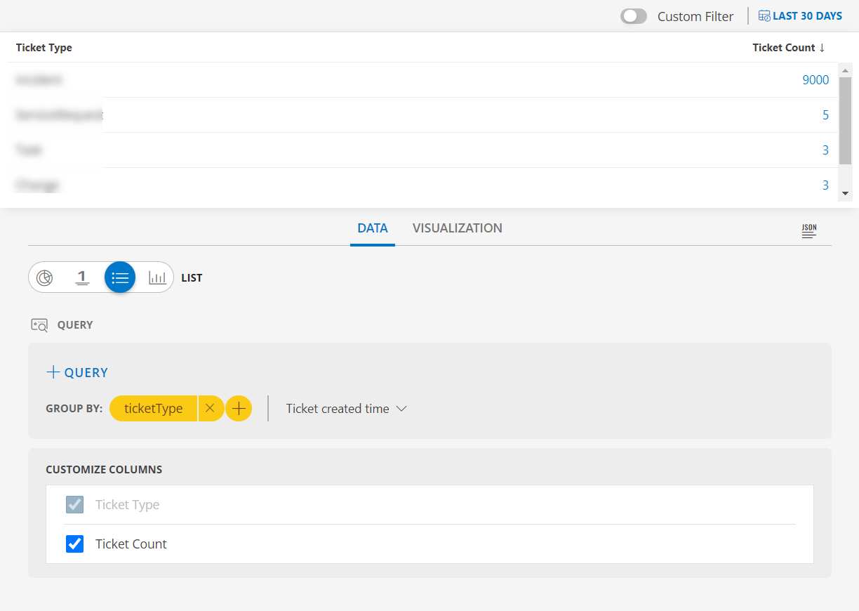
The following is a sample illustration of a multi-column list:
- In the CUSTOMIZE COLUMNS section, select the checkbox to display the information.
| Functionality | Description |
|---|---|
| Ticket Type | Type of the ticket Notes: By default Ticket Type is checked and cannot be unchecked. |
| Ticket Count | The total count of ticket. |
- Enable the Split subgroups to view each grouping as a separate row.
Notes:- The multi-column list and split subgroup options are available for List chart only.
- The colors are displayed based on the default color categorization of tickets.
- Click the count or any column in the multi-column list to drill down and see the contextual list of tickets in the alerts browser.
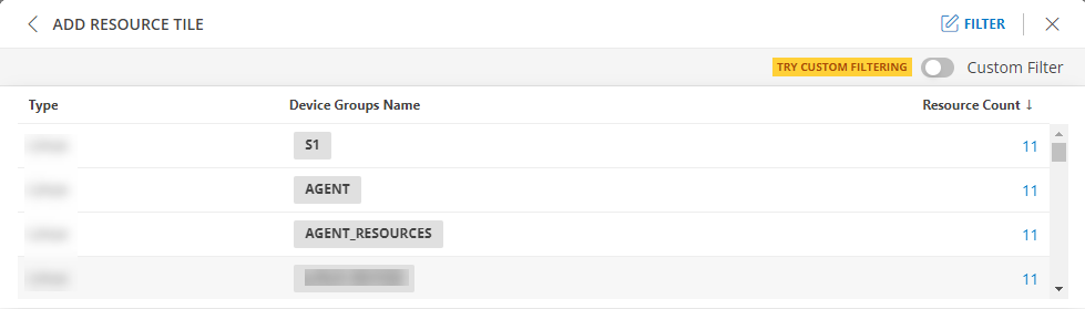
- Enable or disable the Resource Count and the Group Count column in the listview displays the count of the Device Groups Names.
- See Visualization to know on how to customize the Ticket Tile.
- Click CREATE. The Resource tile is created and displayed on the main dashboard page.
Ticket stats
Click here to view Ticket stats
- Select the Ticket stats tab. This enables you to create a custom tile.

Click the + QUERY and select the attributes from the drop-down list as you build the query. Click the + button to add additional attributes.
Notes:
- By default the OPSQL query is already generated. Below is the OpsQl:
ticketType = "Incident" AND status IN ("New", "Open")Note: You can combine multiple filters together to view only the required alerts. The query is completed and the results are displayed in the preview graph.
Alternatively, click </> to use the advanced query builder.
Note: Click </> again to close the advanced query field and switch back to the basic query builder format.Enter a query or click inside the box to see a list of OpsQL attributes.
Select the data type from the following options:
| Chart Type | Description |
|---|---|
| Pie | Displays a pie chart. |
| Single Value | Displays a single value. |
| List | Displays values in a list format. |
| Bar | Displays the bar representation of the values |
- From the GROUP BY option, select an attribute. You can select up to two attributes.
The following is a sample illustration of a multi-column list:
- In the CUSTOMIZE COLUMNS section, select the checkbox to display the information.
| Functionality | Description |
|---|---|
| Ticket Type | Type of the ticket Notes: By default Ticket Type is checked and cannot be unchecked. |
| Ticket Count | The total count of ticket. |
- Enable the Split subgroups to view each grouping as a separate row.
Notes:- The multi-column list and split subgroup options are available for List chart only.
- The colors are displayed based on the default color categorization of tickets.
- Click the count or any column in the multi-column list to drill down and see the contextual list of tickets in the alerts browser.
- Enable or disable the Resource Count and the Group Count column in the listview displays the count of the Device Groups Names.
- See Visualization to know on how to customize the Ticket Tile.
- Click CREATE. The Resource tile is created and displayed on the main dashboard page.
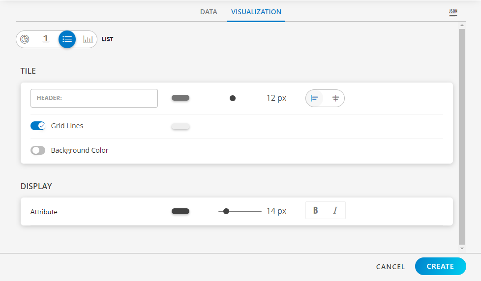
Visualization
- Click the Visualization tab to customize the visualization further:
- HEADER: Set a name, color, size, and alignment for the header.
- Grid Lines: Select the color of the grid lines, enable or disable the grid lines by clicking the toggle ON or OFF, Grid Lines option.
Note: By default the Grid Lines is enabled - Background Color: Select the background color, enable or disable the background color by clicking the toggle ON or OFF background color.
Note: By default the Background Color is disabled. - Attribute: Select the color for the attribute, the size, bold or Italics.
Examples
The following are example illustrations for each visualization:
PIE visualization
The following is the PIE chart visualization with the inputs:
- Attribute -
clientName CONTAINS Clientname - Group By
- Attribute 1 =
assignee - Attribute 2 =
status
- Attribute 1 =
- Legend -
{{nativeType}} - Dashboard time range =
All Tickets
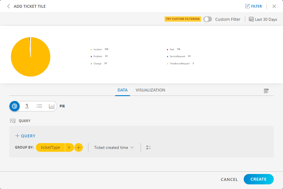
PIE dashboard view
The following is the PIE chart dashboard view:

LIST visualization
The following is the LIST visualization with the inputs:
- Attribute -
agnetInstalled = true - Group By
- Attribute 1 =
type - Attribute 2 =
deviceGroups.name
- Attribute 1 =
- Split subgroups =
disabled
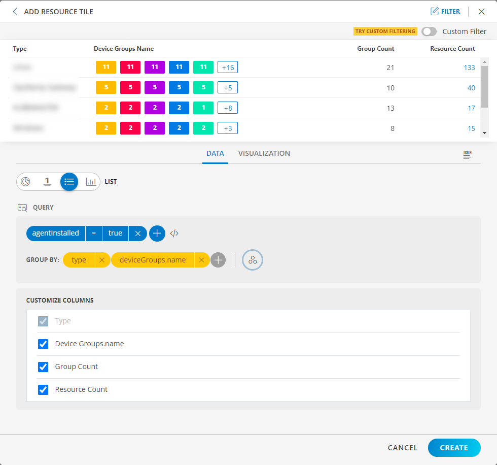
Notes:
- When two group bys are provided then Group Count is displayed and by default it is disabled.
- If Group Count is enabled the second group bys count should be displayed.
- Drill down is not possible on Group Count.
- Group Count displays the second group by count.
The Split subgroups toggle switch displays results with the attribute name. The following is a sample illustration:
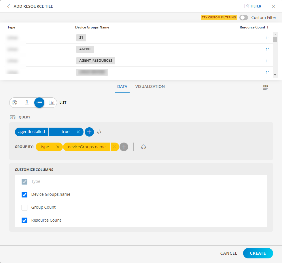
LIST dashboard view
The following is the LIST dashboard view:
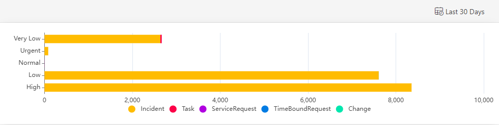
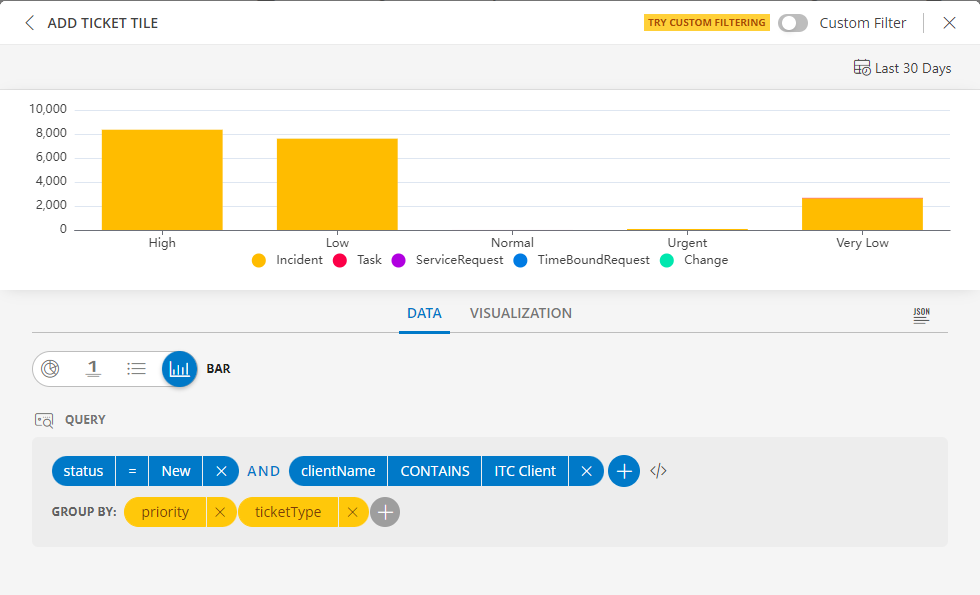
BAR visualization
The following is the BAR visualization with the inputs:
- Attribute -
status = New - Group By
- Attribute 1 =
priority - Attribute 2 =
ticketType
- Attribute 1 =
Notes:
- Select Horizontal or Vertical representation of the data from the Orientation dropdown list box in the Visualization tab.
Note: By default the Horizontal axis is enabled. - Click the stacked bar to display the multiple group information.
- Per query, Time Series tile displays up to 30 series which are mapped to the order of this color chart. You may click a swatch to edit color or click + drag to reorder.
- You may enable and disable a legend by clicking the name/color of the specific legend.
- Click Go Back to return to the view all the legends.
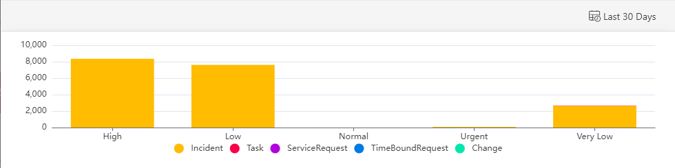
BAR dashboard view
The following is the BAR dashboard view:
Horizontal Axis view
Vertical Axis View