| Function | Description |
|---|---|
| Create Dashboard | Manually create a dashboard using the dashboard create tool. |
| Import Dashboard | Import a JSON file previously exported using the dashboard export option. |
| Create Collection | Create a folder for grouping dashboards. |
| Search for dashboards or collections | Search for a dashboard or collection by name. |
Dashboard list
The dashboard list shows curated, pre-configured dashboards and user-created dashboards. Click on the dashboard entry to view the dashboard. Dashboards are only displayed if the associated integration is installed.
Visualization
A dashboard visualization is created after specifying your metrics for the dashboard.
Metric tiles support:
- PromQL-driven line and bar time-series: Displays metric values over time.
- Single-value: Displays a metric value at one point in time.
- List: Displays the data in as chart types.
- Honeycomb: Displays the data as a honeycomb chart type.
Time-series
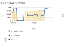
The time-series option is identified as Combo. Metric values display over time and can support up to two queries. The metric can be represented by a line chart or a bar chart.
Single-value
The single-value option is identified as Value. A metric value displays at one point in time. Queries that return multiple series must have an aggregation. For example, avg(system_cpu_usage_total)
List
The returned series and associated metric values display at a single point in time, in list form up to 30 time series. The values can be sorted by name and value.

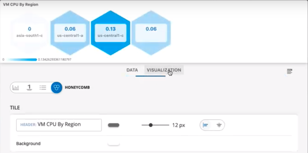
Honeycomb
Displays the data as a honeycomb chart type. The following graphic shows a honeycomb display of VM CPU By Region.
Metric tile customization
The following elements are used to customize visualizations:
| Field/Element | Description |
|---|---|
| Header Label | Add a title to your chart. |
| Grid Lines | Enable or disable grid lines. |
| Background | Change the background color. |
| Display | Toggle between Line and Bar charts. |
| Legend | Enable or disable a legend display. |
| Data Color Mapping | Change the color of each series. Color pallets are customizable for time series charts, only. |
| Axis | Enter and customize axes labels. |
| Thresholds | Configure the chart to change color and background color when a specified threshold or condition is reached. This applies only to single-value and list chart types. |
Text tiles
Text tiles are used to provide messages and descriptions for dashboard content.
Image tiles
Images can be uploaded as tiles.
Filters
| Filter Type | Description |
|---|---|
| filter on time range | Select a time range to filter the start time and end time for displaying metric data. Select pre-defined time intervals or use the date time-picker. |
| filter on variables | Assign a named variable to the value of an attribute to toggle between series to display. |
Collections
Collections group dashboards allow you to organize dashboards. You can copy and move dashboards to a collection.