Introduction
Dashboard 2.0 provides an at-a-glance view of the performance and health of your infrastructure and services. Powered by the UI-based or the advanced Prometheus Query Language (PromQL) and OpsQL queries, you can query metrics for most use cases to quickly identify issues.
Dashboard 2.0 permits you to:
- Visualize any data collected using flexible queries.
- Customize charts for personalized data visualization.
- Leverage out-of-the-box content to get metrics from commonly used services.
- Create new dashboards and reuse existing dashboards for easy portability.
- Create data-rich charts using PromQL and OpsQL.
The following steps let you create a Dashboard 2.0 visualization from a PromQL or OpsQL basic or advanced query building options:
- Create the dashboard.
- Create a Metric, Service, Alert, Resource, Ticket, Text & Image, Schedule, and Embed tiles.
- Specify a PromQL or OpsQL query to populate your visualization.
- Select from Line/Bar, Value, List, Gauge, Honeycomb, or Pie chart type.
- Customize the visualization.
- View the dashboard on the main dashboard page.
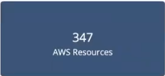
For example, choosing a value chart populated by a sum(usage_cloud_provider_aws) PromQL query gives you the following visualization:
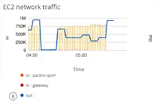
Or, choosing a combo chart to graph the inbound and outbound traffic on an ec2 instance using a usage_cloud_provider_aws{instance="ec2.instances"} PromQL query displays:
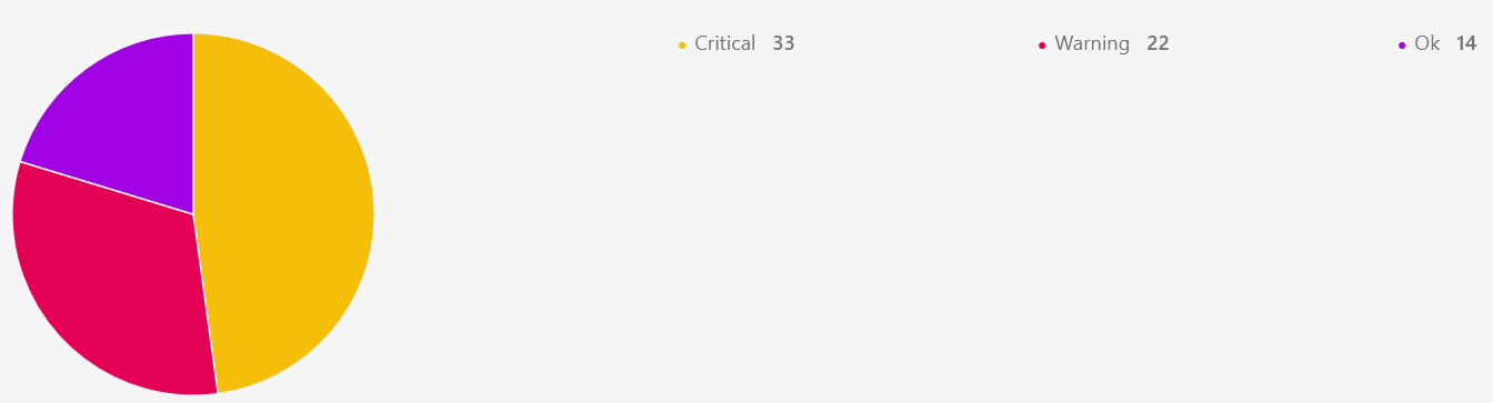
Or, choosing a pie chart populated by a $alertType = "Monitoring" OpsQL query displays:
In all, you can choose from six charts, described in more detail in Charts, choosing the one that best represents your data and use case:
- Line/Bar displays values in a line or bar graphic.
- Value displays a single value.
- List displays values in a list format.
- Gauge displays multiple time series using a gauge graphic.
- Honeycomb displays multiple time series in a hexbin or hexagonal graphic.
- Pie displays values in a pie chart format.
Learn more about individual chart types in the Chart Library.
Tile category mapped to Widgets
| Alert Tile | Service Tile | Metric Tile | Resource Tile | Ticket Tile | Maintanence Tile | Image Tile | Text Tile |
|---|---|---|---|---|---|---|---|
| Alert trend | Service Availability | Metric Timeseries | Custom attributes | Service Desk | Schedule maintenance stats | Image | Text |
| Resources list by alert volume | Service Status | Metric Value | Inventory by type | ||||
| Alert Volume | Metric List | Inventory by OS | |||||
| Geo-map alerts | Top metric utilization | Site Availability | |||||
| Resources Distribution by metric | Resource Group Availability | ||||||
| Device count by metric | Patch status | ||||||
| Patch pending approvals | |||||||
| Geo map Resources | |||||||
| Resource Availability | |||||||
| Network backup status |
Conversion Tool
The classic dashboard will have Export as Dashboard 2.0 JSON option.
Legacy Replacements
| Widget | EOL Replacement |
|---|---|
| Active console | Active console indication |
| Activity log | Integration/Application UI to display the failures |
| Antivirus stats | Moved to Reporting Apps |
| App integrations failures logs | Moved to Audit logs, navigate to Setup > Integrations > Audit Logs |
| Cloud Insights | To be available as Reporting app. |
| Patch Compliance | Available in Patch management 2.0 as Patch compliance Card |